Last week the team at Ashcraft Design hit up the LA Auto Show. Every year Ashcraft Design goes to the LA auto show for the inspiration, to see upcoming trends, and just simply because we love cars and the role they play in everyday lives and the Southern California culture.
The LA Auto Show, unfortunately, in recent years has been on the decline. The LA Auto Show used to be a showcase for seeing new technologies, concept cars, and get an outlook of the future of the auto industry. But Detroit, Geneva, and Tokyo now seem exclusively to be taking on that role.
This years show was lackluster. You could have almost had the same experience just walking through car dealers throughout Southern California. Each year the show seems to get more sparse and less effort shown by each auto manufacturer. I mean Audi had a better display at CES than this years Auto Show. This could show the significance of how technology is increasingly bridging gaps between products in our everyday lives and our transportation. But have the car companies gotten lazy? With the availability of information on the internet have companies just figured that it is easier to let the consumer explore things themselves online? Isn’t this then the perfect opportunity to provide an experience for the consumer to to learn about the brand in an physically interactive way? It looks like this is a missed opportunity. The company that came closest to achieving this was Porsche. While not on the level I am suggesting, Porsche was one of the few automobile manufacturers that actually provided something of an experience that touched upon their heritage and spoke to their brand. Which also leads to my favorite car of the show, the Porsche Cayman GT4 Clubsport. Normally, I am not a fan of race kits, wings, graphics, etc on cars but with Porsche racing heritage validating its authenticity, unique – tastefully done angular graphics with an interesting blend of matte gray to gloss yellow colors, all draped over an already good looking car, it was a striking.
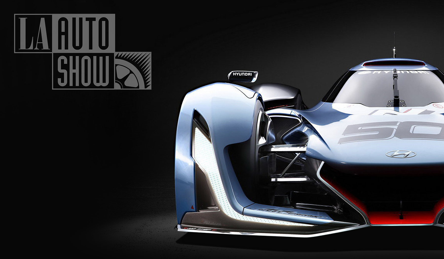
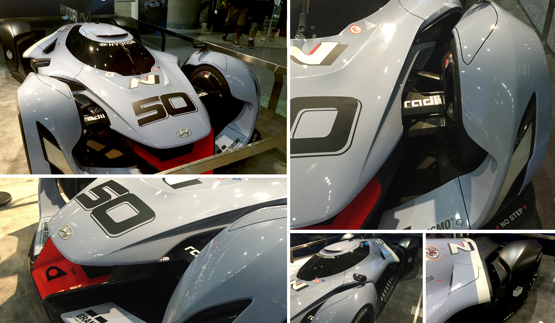
Hyundai put out one awesome concept supercar called the Hyundai N 2025 Vision GT. Surprisingly, it was not at their main booth but outside the main doors in a side lobby. It seemed odd to have the most exciting thing hyundai had to offer seem so hidden away in a tiny booth. It almost felt as though they weren’t proud of it which blew my mind because it was so dynamic and engaging. The car is designed around a hydrogen fuel cell system housed within a CFRP monocoque chassis. It puts out the equivalent of 850bhp from a combination of fuel cell stacks and a super capacitor system, delivered via four in-wheel motors. The boat-shaped underbody creates downforce and air-brakes to aid deceleration and reduce drag at certain speeds.
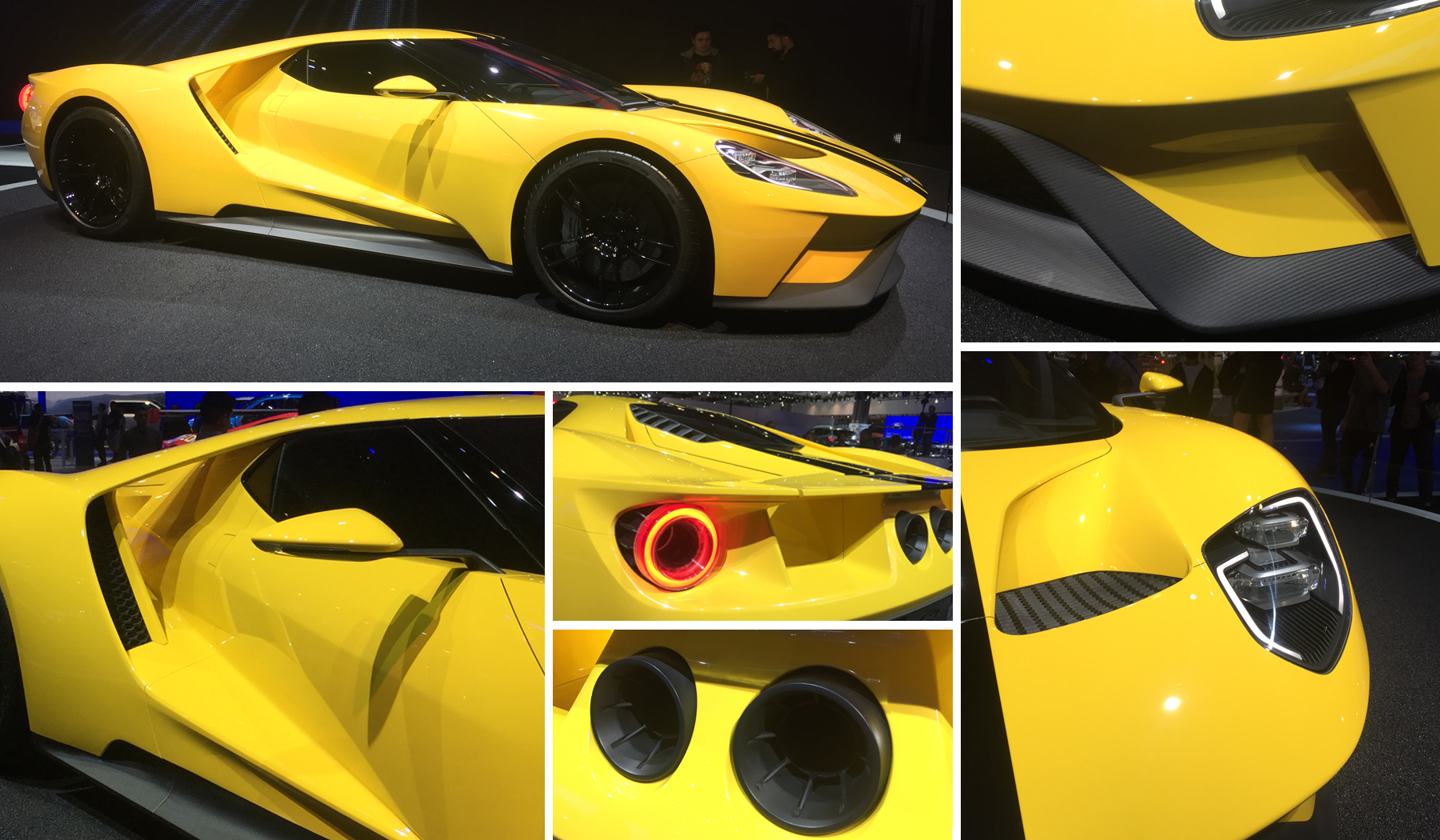
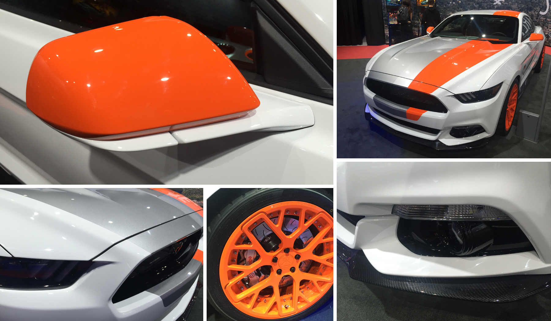
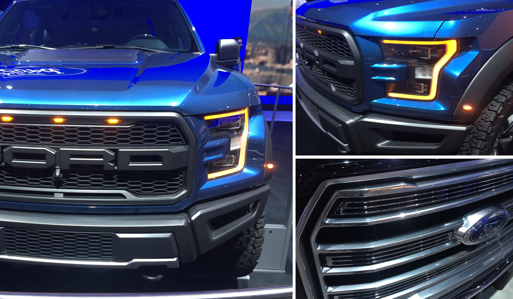
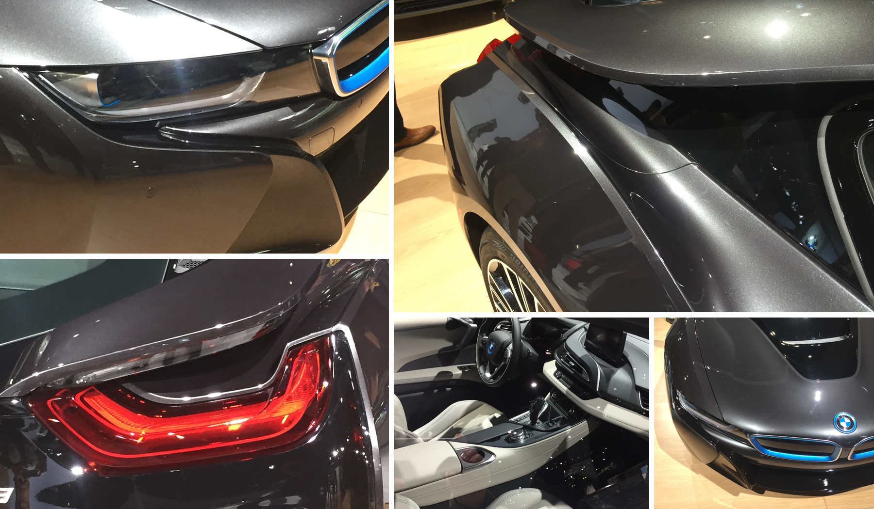
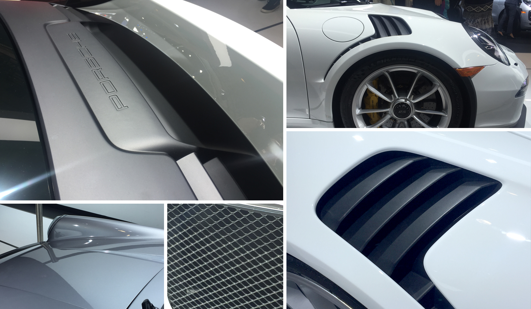
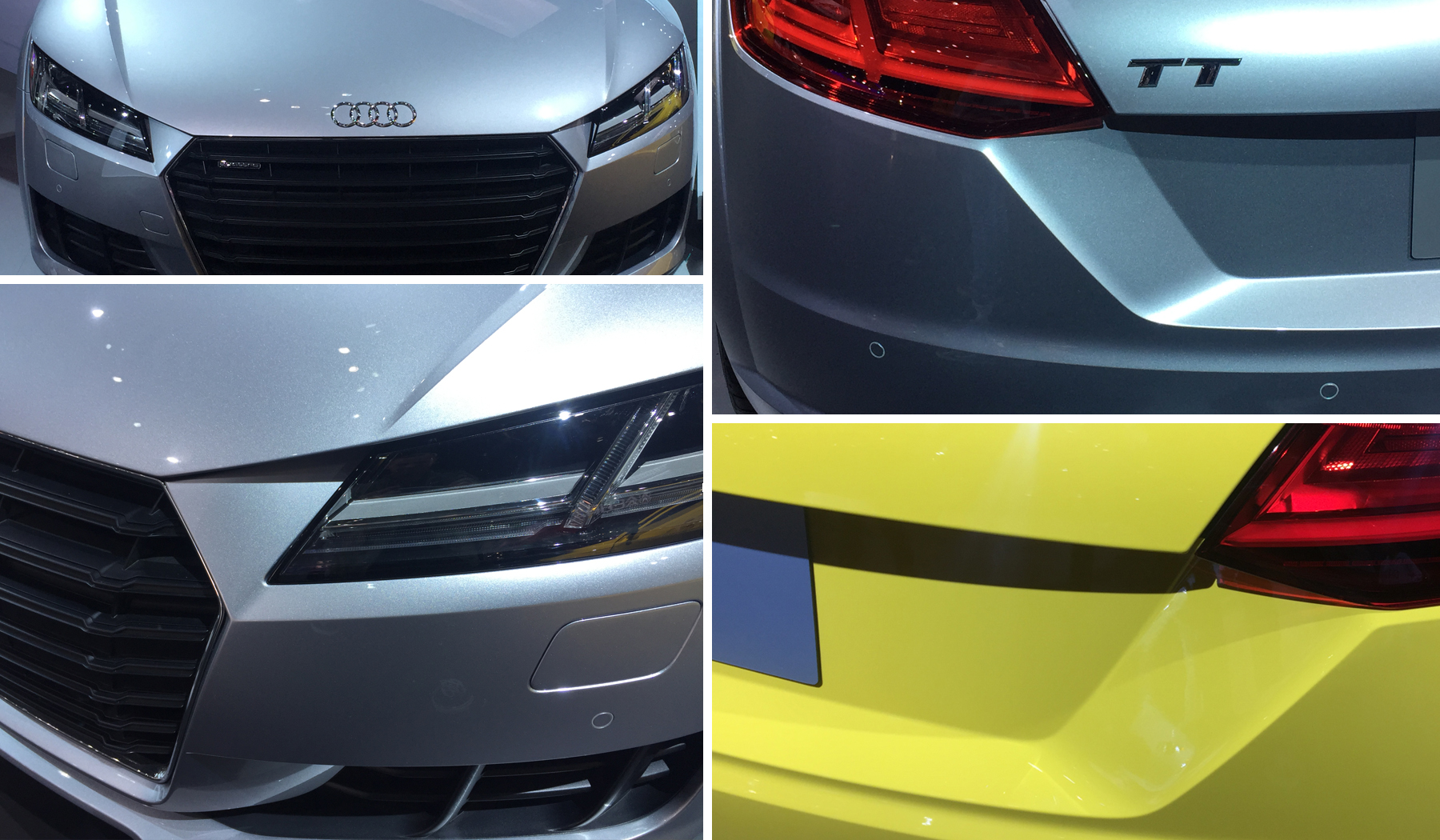
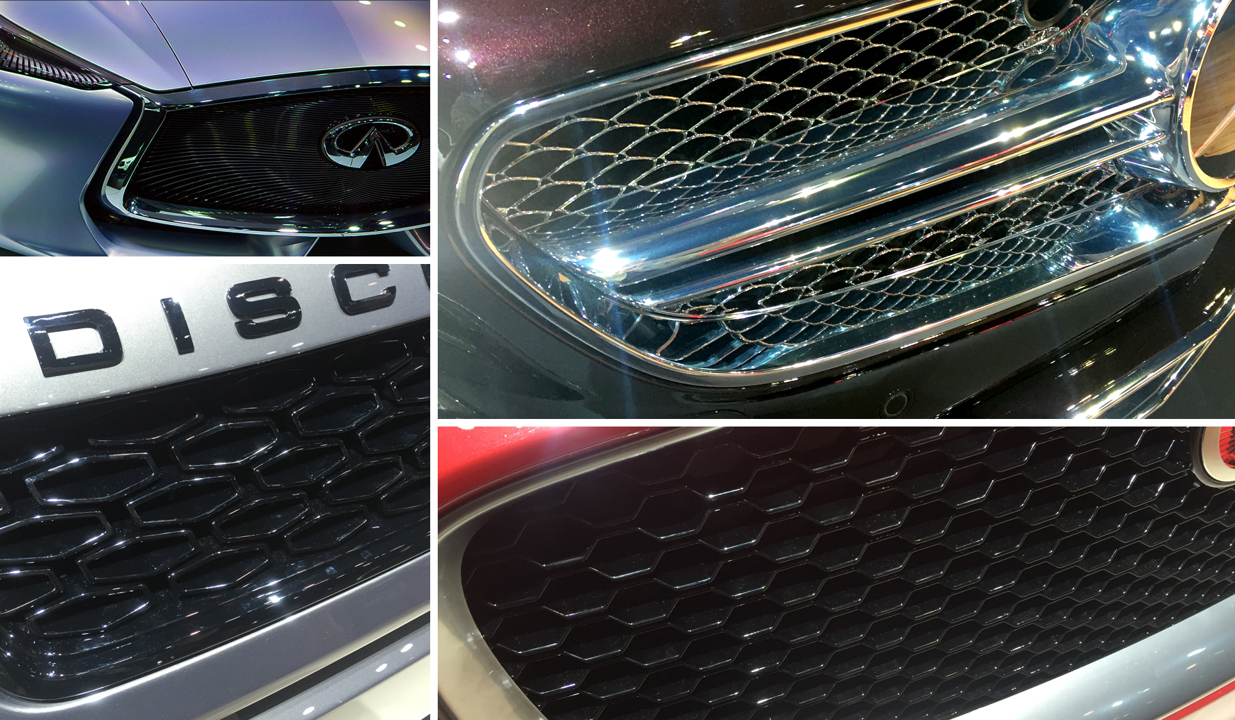
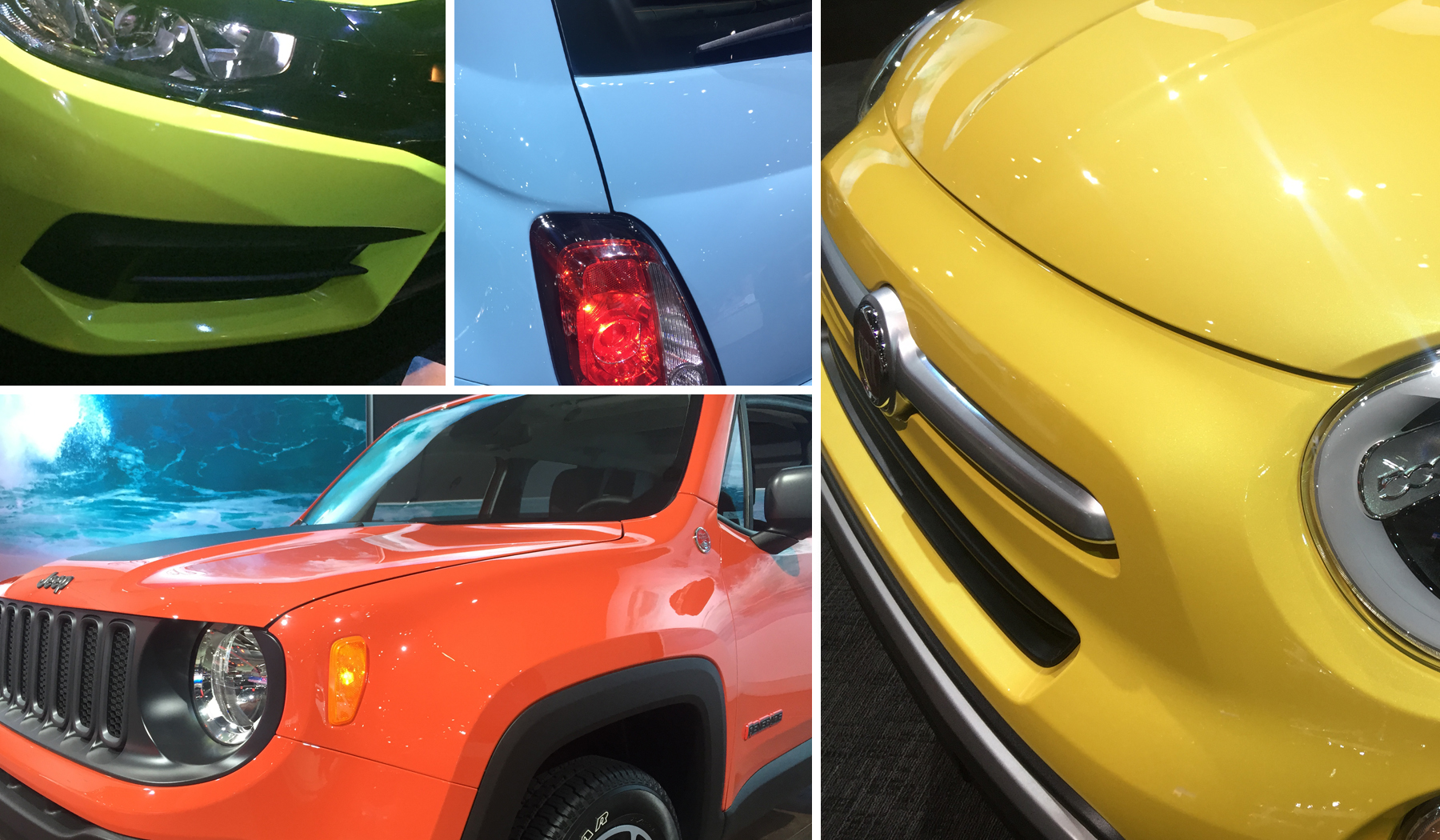
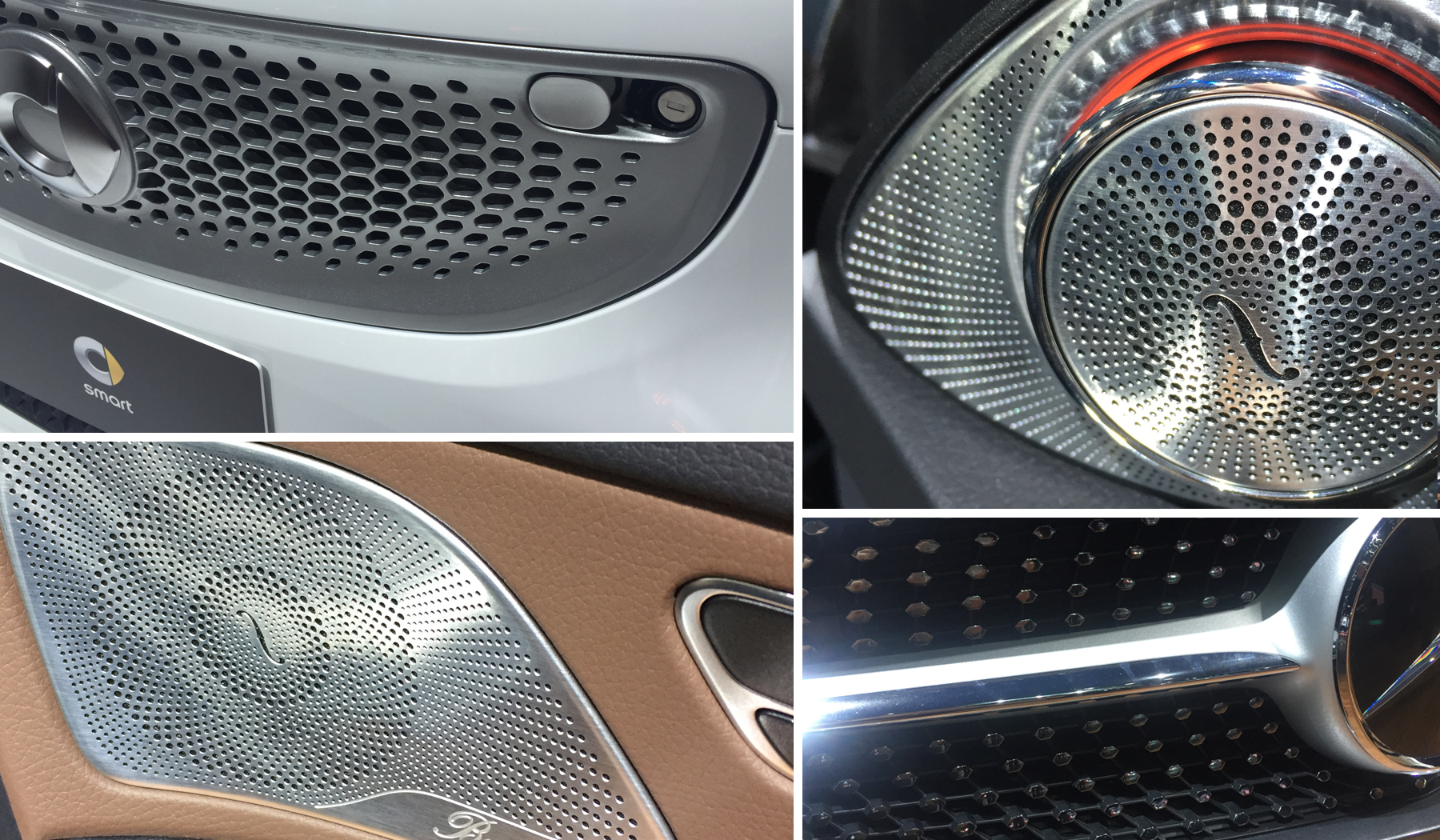
We saw a lot of different approaches to the way manufacturers were treating the details of the headlights, taillights, grilles, rims, etc. Unique headlight treatments are now expected, with Audi having paved the way with their original LED headlamps. The details can no longer be an afterthought, we are increasingly seeing new ways of applying textures, patterns to areas previously given little thought. It is these details that will elevate a car or product beyond its competitors. Such a focus on detail used to be relegated to expensive products but we have seen this trickle down to even the most basic car or product. Attention to details enhance the user experience through a level of discovery and engagement. Details give the consumer something to engage with to connect with and explore a product deeper.
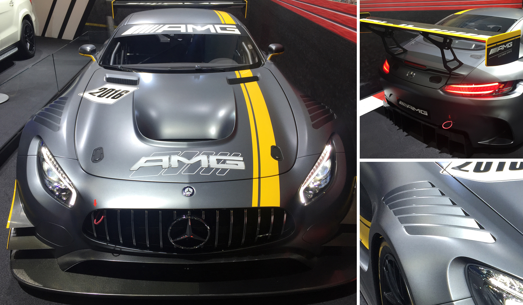
Scattered throughout the show, there seemed to be a push for playful, bright pastel colors, almost like the color of a bag of Tropical Skittles, in the smaller car segment. Whether or not this will become a major trend on most cars, is something that I highly doubt but could be seen more often in the smaller car market where buyers tend to be a bit more youthful and open to more expressive uses of color. The slightly more sophisticated matte gray to gloss yellow paint combination was surprisingly seen on more than just the Porsche Clubsport, Mercedes had a couple cars in that same color combination.
A common trend throughout most all car companies is what we call deconstructed design. It is a layering of elements that break down the overall design by carving away forms and blocking out details. Few companies have successfully implemented it. But when done well can really engage the viewer through the use of interesting surface treatments that play with light, highlights, and unusual intersecting forms. But when done unsuccessfully it looks like a students poor attempt at sculpting in art class; shaping the object at random will with no care as to reason or how one shape affects another. This type of design trend is not timeless and will not have a lasting impact over time.
With all of the advances being made in technology and the auto industry I had the hope that type of excitement and technology would be prevalent throughout the auto show. Instead I felt as though I was going through the motions of walking into an auto dealer and having to deal with car salesmen. Has the internet created such a disconnect between the consumer and the car company that the auto show has just become one more area that is no longer a good return on investment? Our role as designers is to provide consumers with experiences that resonate emotionally; connecting consumers to brands. I can’t speak for the general public but for me, the car companies at the LA Auto Show failed to connect with me.

