“The duality of elements, both man made and natural create a dichotomy of visuals that manage to exist in harmony.”
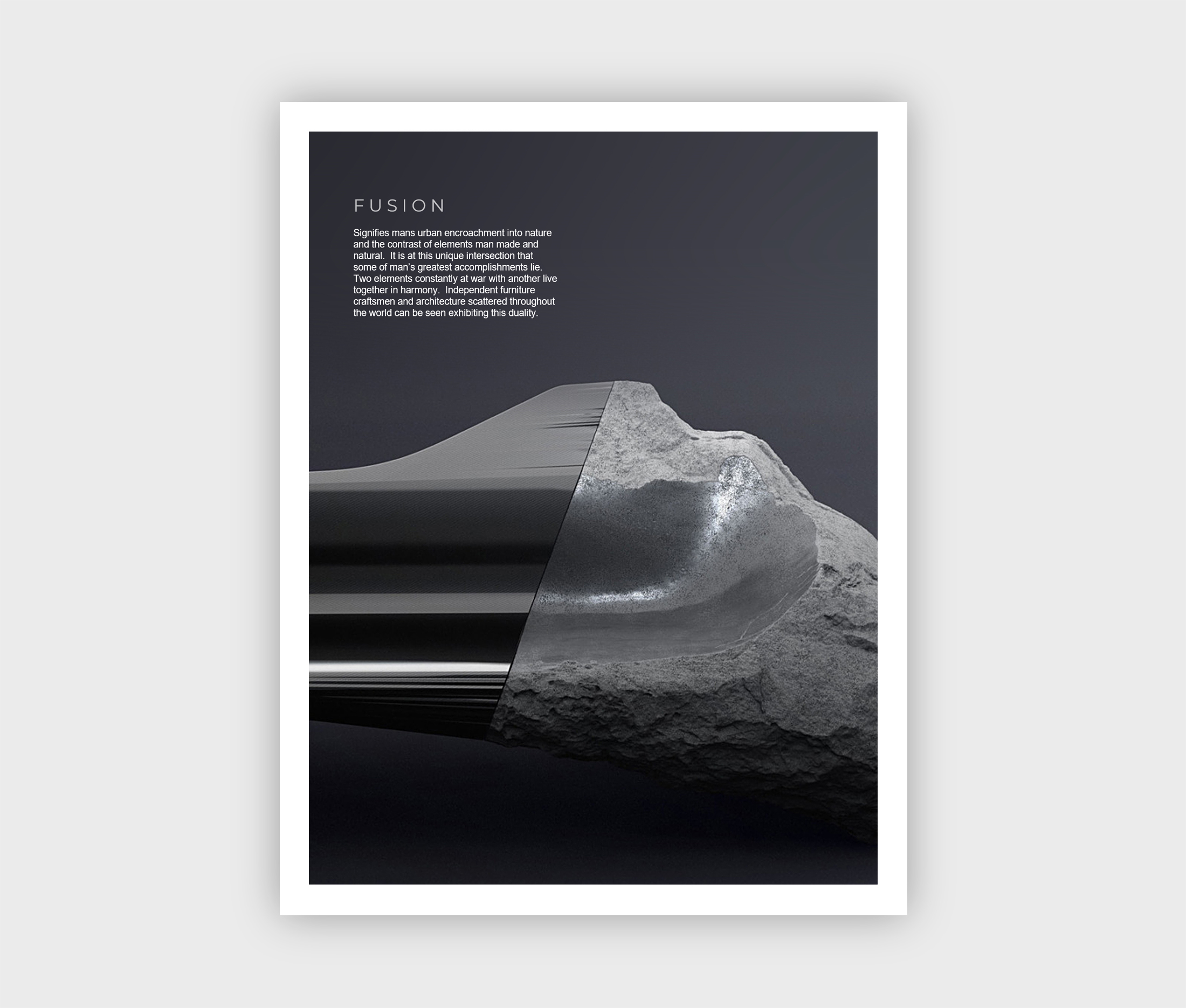
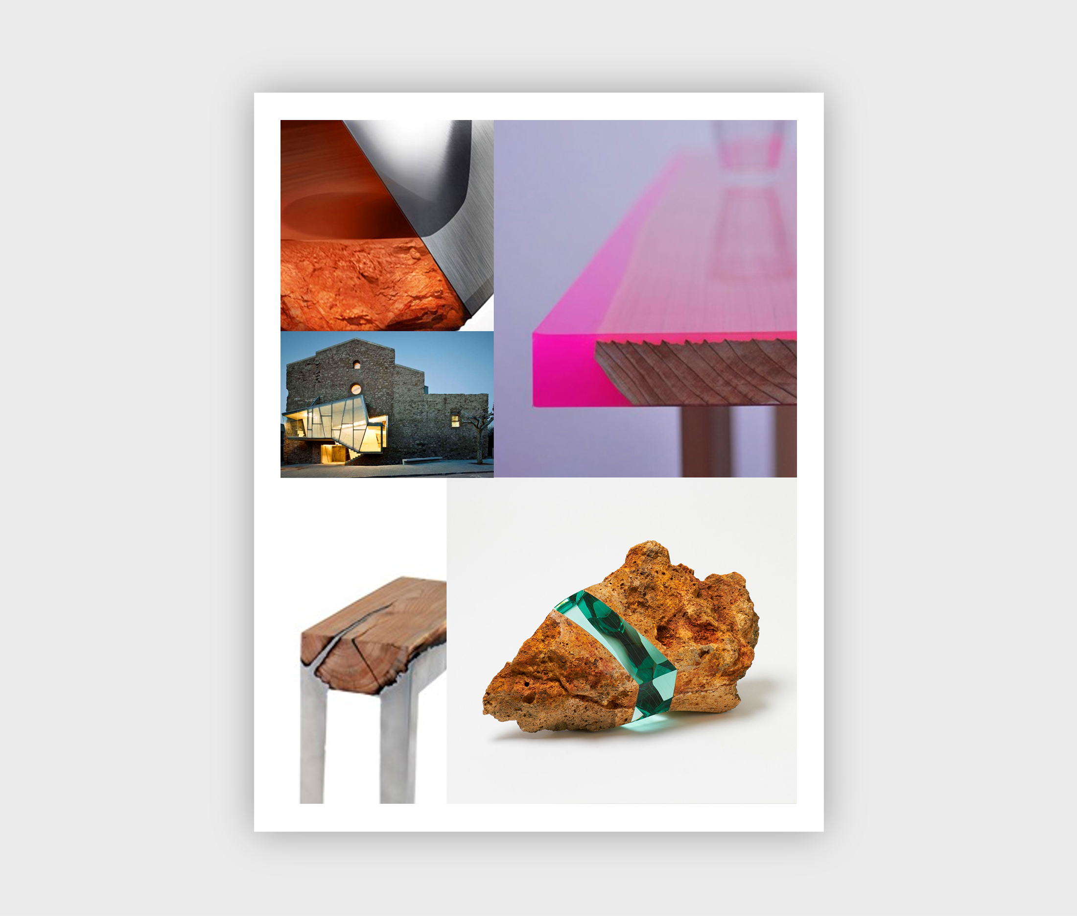
Above are pages taken from our global trend report giving a glimpse at a design trend we call Fusion. Fusion is a trend that we are seeing throughout independent furniture, art and architecture. It symbolizes the war between man and nature and the contrast of elements man made and natural. It is the juxtaposition of opposites. Two elements constantly at war with another come together in harmony.
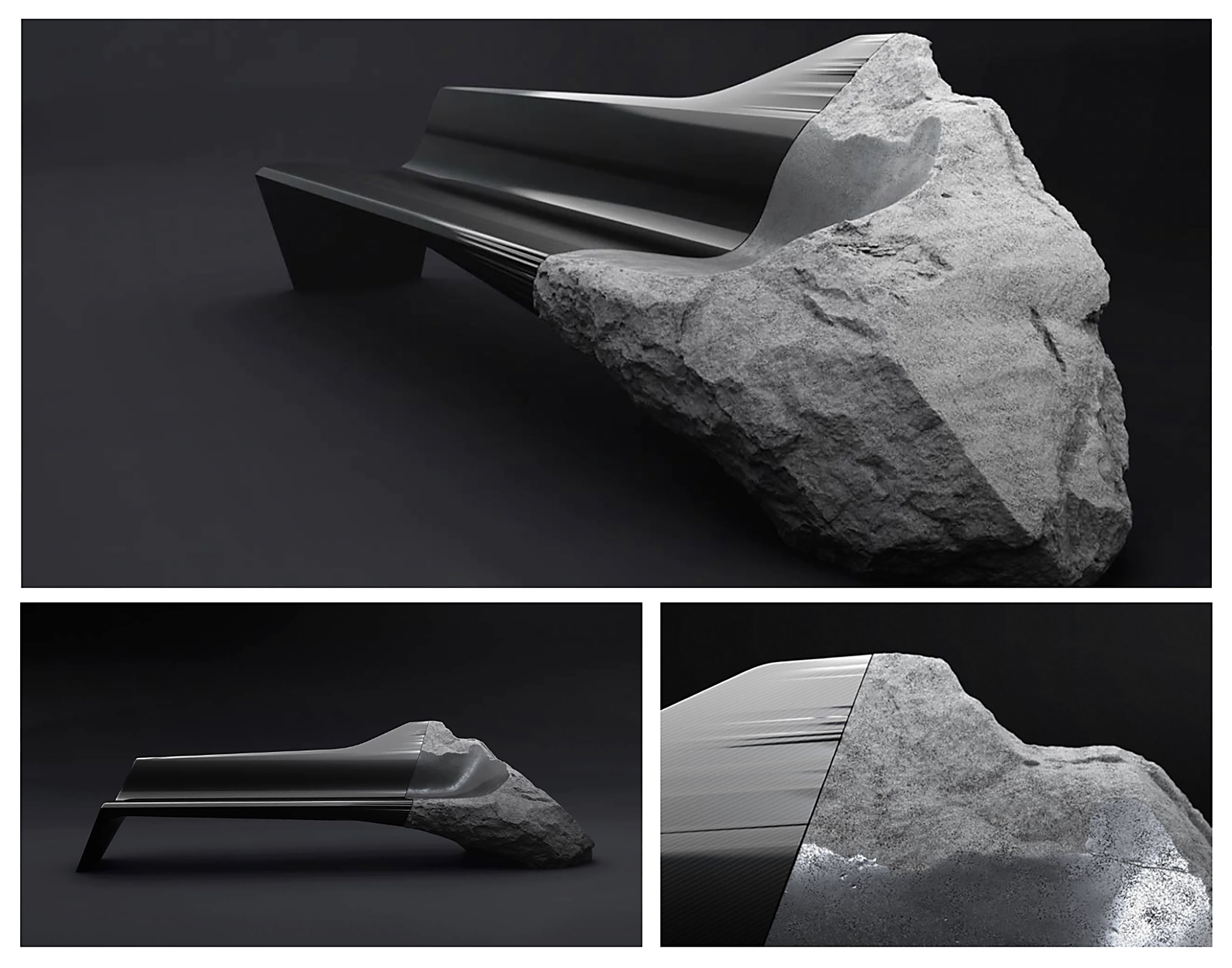
The Onyx sofa by Pierre Gimbergues for Peugeot in the first image at top and seen below is a great example of this trend.
“At Milan, with the ONYX sofa, we are drawing a thread between the ONYX concept car, an alliance of efficiency and the use of audacious and natural materials, and the ONYX sofa. By means of a sharp straight cut, this contrast is powerful, voluntary and assumed in the way we look at the materials and how they are used : the hi-tech carbon fibre with its very structured and technical texture, its shapes precisely adjusted to the volcanic stone with its texture & fault lines, perfectly adjusted in its dimensions and proportions, but with which one accepts not being in complete control, like the stonemason’s random chisel marks.” The ONYX sofa has become a demonstration of this, questioning the performance of materials, and with no antagonism between progress and nature, between ultra technological materials and raw and natural materials”
http://www.peugeotdesignlab.com/en/projects/onyx-projects/onyx-sofa
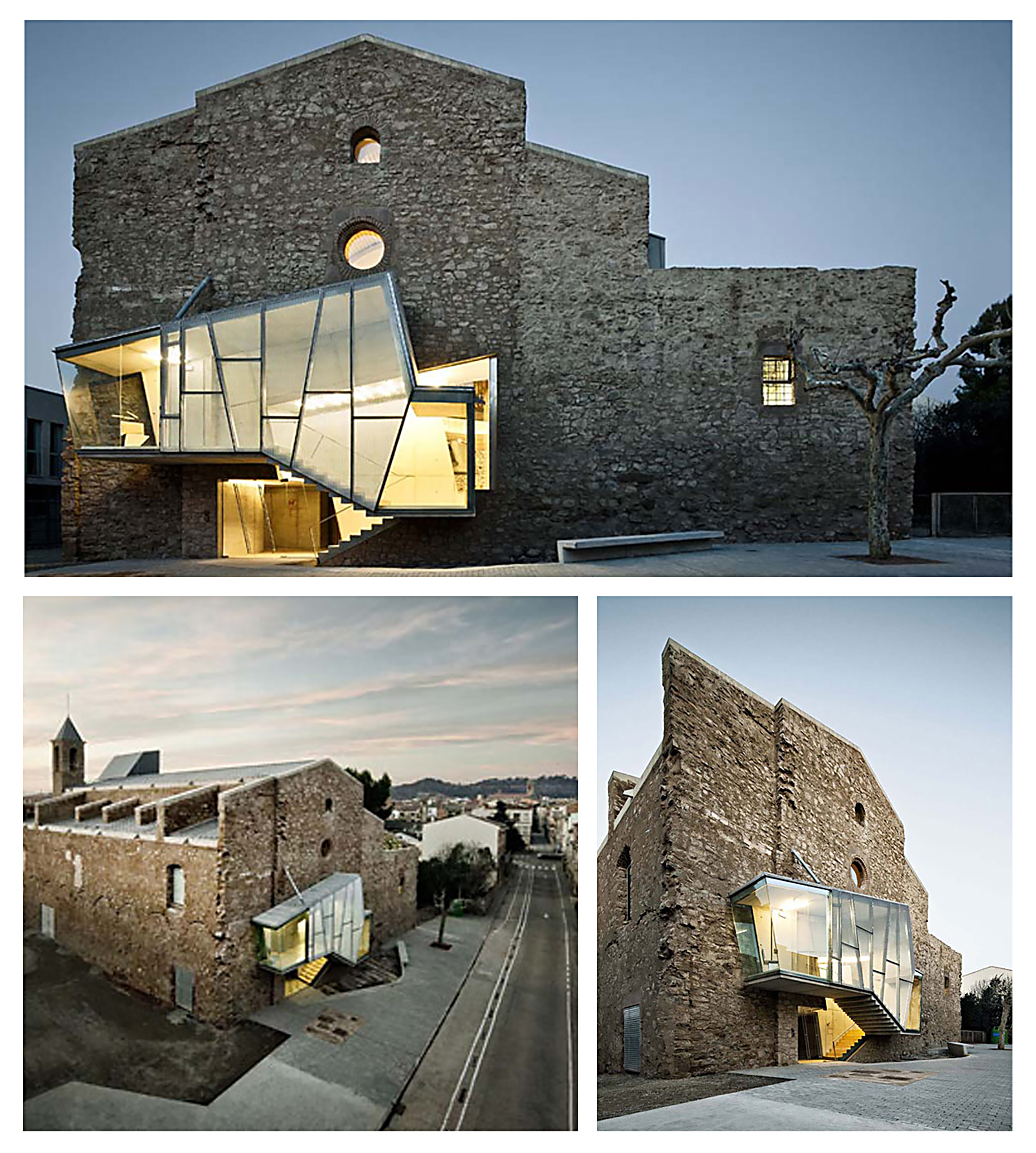
The New Saint Francis Convent Church by Architect David Closes (seen below) is a good example of a different take on the trend through merging the old and the new, the modern and the traditional. There is a vast difference between the church and the new addition yet they both work together to celebrate progress without destroying the past. “A crippled 18th century church has been restored and rejuvenated with a new purpose and life. In a last attempt to save the church, the Catalan architect David Closes was called to the scene and did a marvelous architectural intervention. His daunting mission – which had an accompanying budget of €1.6 million – was to integrate an auditorium and multi-functional cultural centre into the church while maintaining original dimensions as much as possible so that whatever historical integrity remained was in fact preserved. And this is where it got interesting, that intersection of old and new. The opposites attract and in this casa it is all a beautiful alchemy. David Closes poetically joined the old and the new; a smart cocktail of history and modernity which converts a church in ruins into an auditorium and a multifunctional cultural facility. When it’s perfectly rendered in this manner, that conterminous architecture is like the best free jazz. When the right notes are played, the mashups of architectural and structural forms are the best type of mashup; it’s the zenith of the mod or hack. We strive for that confluence and seek it out.”
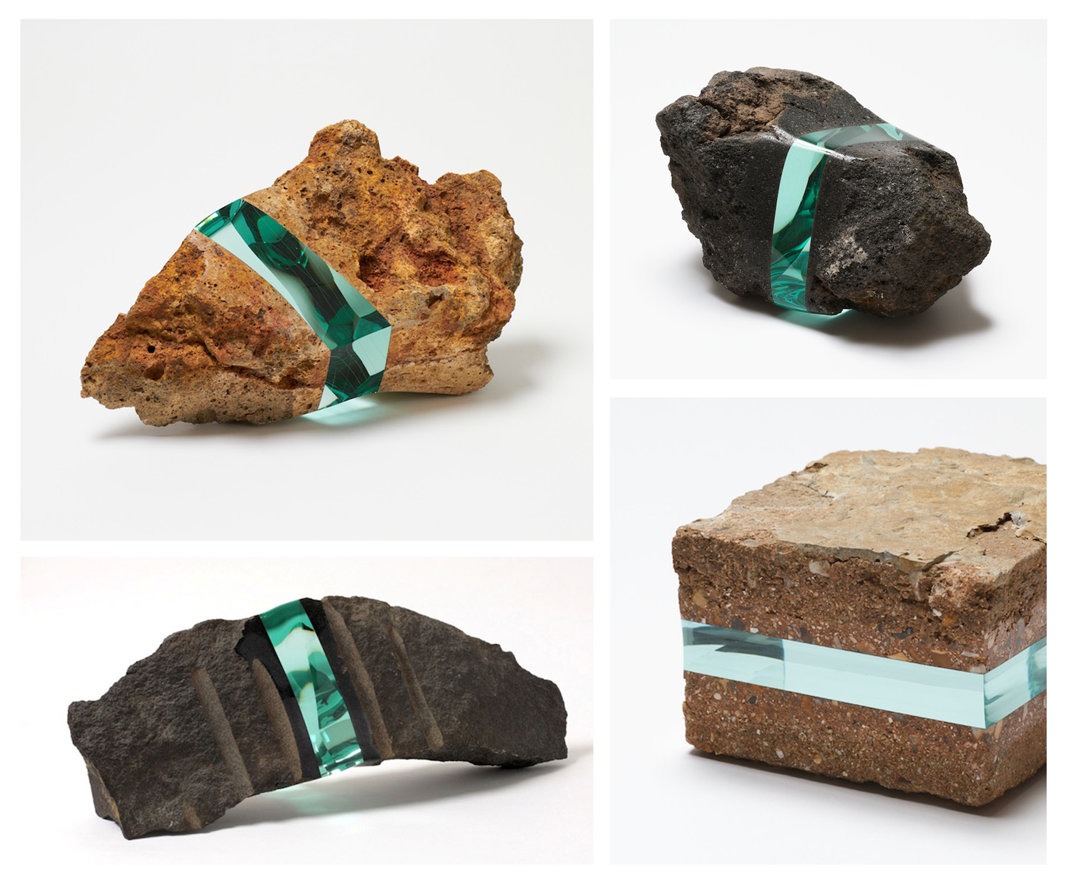
In the images below you can see how “Tokyo-born artist Ramon Todo creates unexpected sculptures by drawing upon basic, solid materials found in nature. To create each piece, he first locates stones and bricks discovered on personal walks through various landscapes. He then removes segments of the stone, which symbolize the history of the land in which it originated, and replaces it with layers of aesthetically beautiful, polished glass.
By blending the two opposite substances, Todo redefines the surface of the materials, creating a new and unexpected texture. The fragmented matter works closely together to form the rough, yet sparkling, sculpture, and the juxtaposition of the delicate material wedged between layers of hard, solid rock is visually exciting. In each piece, the rock is supported by the glass, redefining a typical understanding of stability and fragility. This unique approach to the natural forms challenges viewers to make sense of the contradictory concepts.”
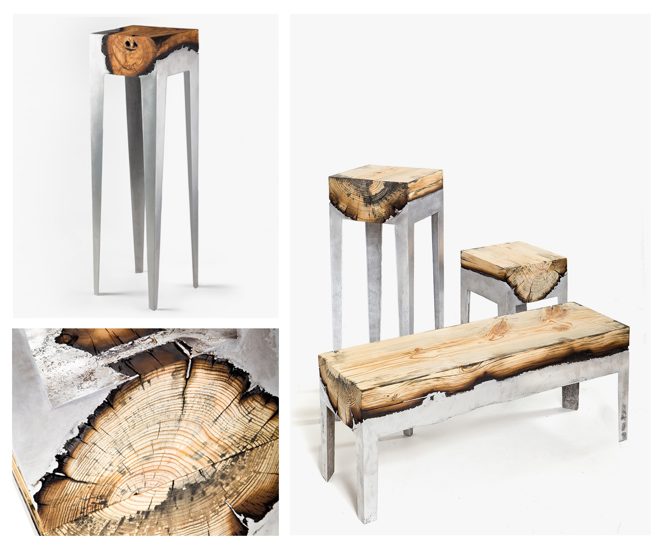
Our last example seen below shows Tel Aviv-based Hilla Shamia Design Studio’s Wood Casting collection.
“The casting process is like a drama, accompanied by high heat, flames and smoke,” Shamia told Dezeen. “This drama produces a third material – coal.”
“The dark coal narrates the love story between the [wood and aluminium], emphasising their initial meeting, outlining a sense of continuation, and maintaining a sense of flow even when the two materials are solid and strong, just like the dynamics between an elderly couple.’ The two frequently-combined contrasting materials were the starting point for the concept. ‘Wood is an organic material, which is influenced negatively by fire and heat; it may burn completely,’ said the designer. ‘Metal, on the other hand, is a natural resource, which is very durable against heat – it simply changes its state, turning from solid to liquid. Using this special technology of casting metal into wood, I was able to originate completely new connections and geometrical adjournments between the two.”
The application of this trend is rarely seen and can be difficult to execute both in the literal sense as well as conceptual in consumer electronics but will add a sense of wonder and awe, uniqueness, visual interest, and tactility welcomed by any consumer.
To get more information on trends and thoughts we have on design and how it impacts your business, sign up for our newsletter below and we will send you a free digital copy.
