“Intentional tension can create positive attention.”
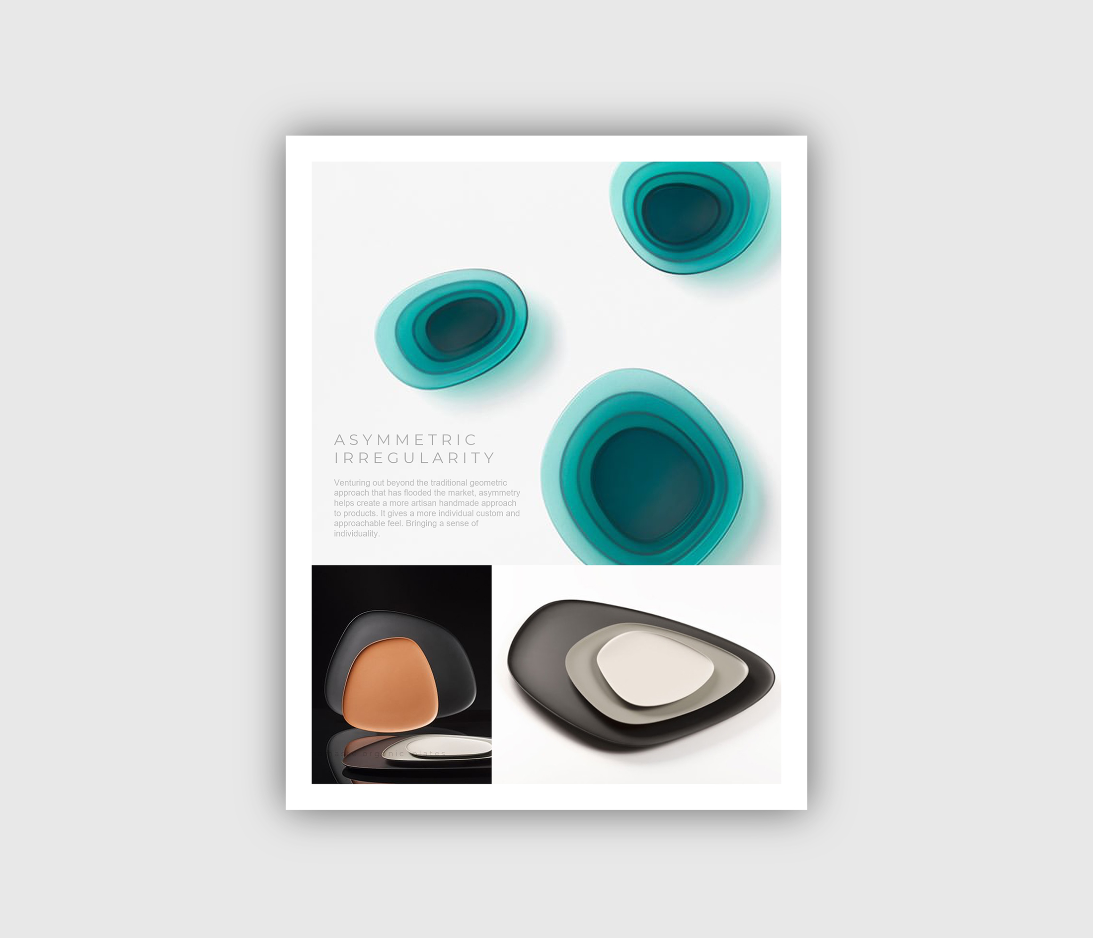
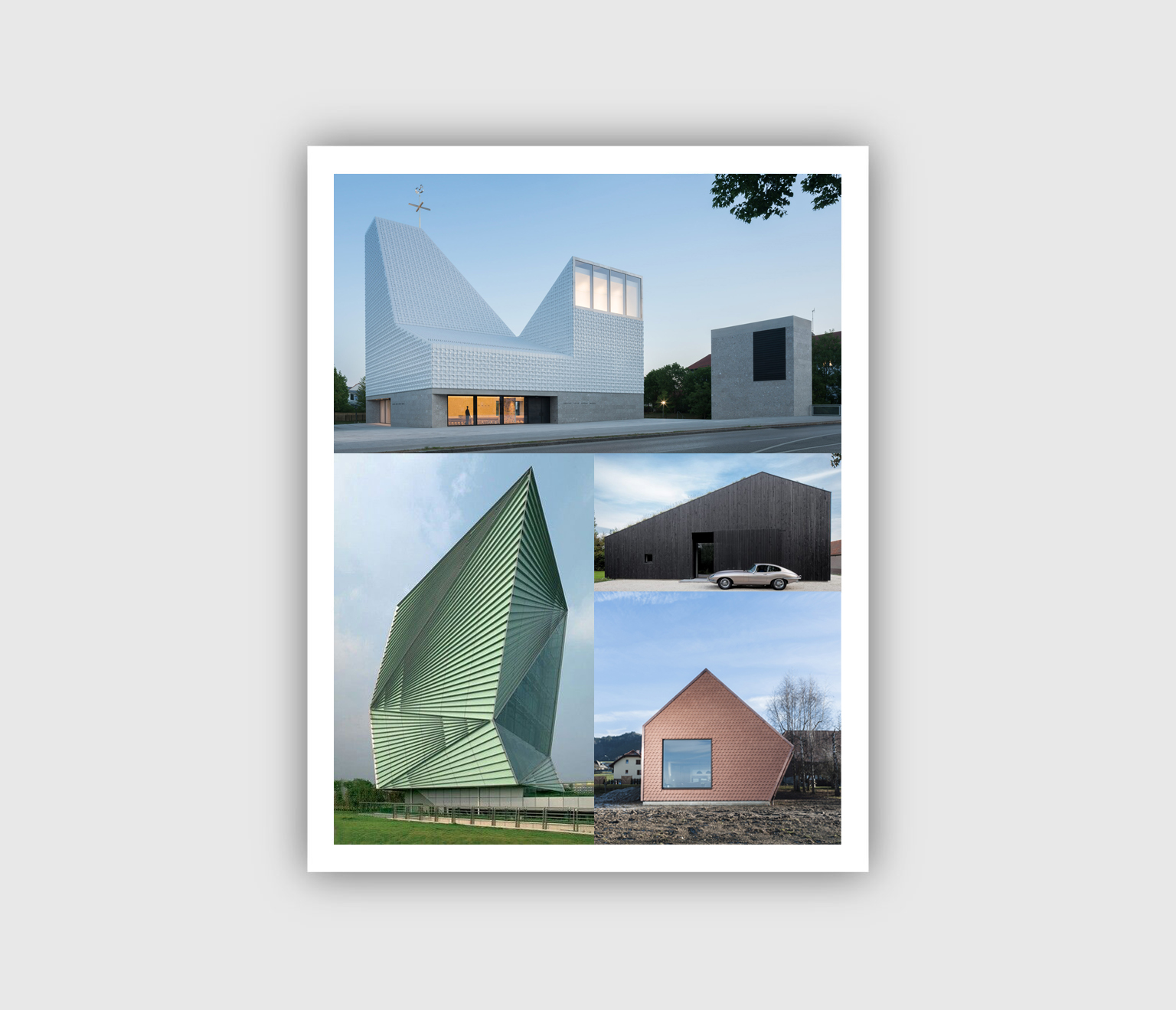
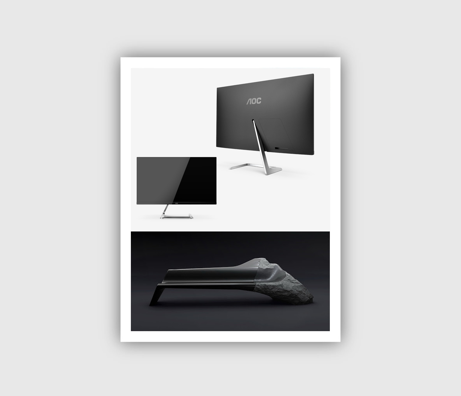
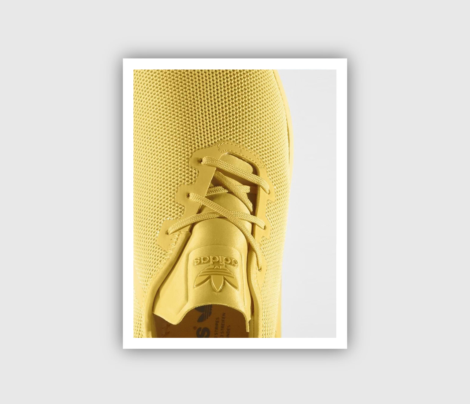
Nothing advances an industry without making someone uncomfortable. Things that make us uncomfortable can bring about the greatest progress. Innovators and first movers of the market take the leap into the unknown without fear of offending traditionalists. Asymmetric Irregularity is a design trend we have seen that can make people uncomfortable. However, it can be used to create intentional tension to bring positive attention. The ability to use visual tension and irregularity in products, architecture and fashion can push the boundary of design, get the attention of new demographics, and grow sales.
Asymmetric Irregular design can be difficult to pull off, but when done well results in beautiful, dynamic products, designs, and experiences. Venturing out beyond the traditional minimalistic, geometric approach, Asymmetric Irregularity in design can help create a more artisan handmade feel. Asymmetric Irregularity can feel more individual, custom, unique and more approachable. It brings a sense of individuality to a product, or experience.
On the opposite end of the spectrum, minimalist design (as seen in Apple products) focuses on symmetrical balance. This type of design can be very structured and rigid in nature. For these reasons minimalism and symmetrical design tends to be timeless but can become dull if not accented by thoughtful details, materials, form, and color.
“Design can be asymmetric yet still balanced and purposeful.”
Asymmetric design is dynamic, evokes curiosity and creates excitement. Sometimes it can create a sense of uneasiness that compels the viewer to step out of their comfort zone. But it is this sense of uneasiness that if done right, can be leveraged to a brands benefit. Proper use of asymmetry is a powerful tool in directing the consumers eye where you want them to look. It can create tension that draws a person in.
However, achieving balance through asymmetry is key. Good asymmetrical design includes balance so that no one part of the project is too heavy for the rest. You can create balance by offsetting elements with space, creating emphasis with form, understanding proportion, adding focus through color, materials and finishes.


At Ashcraft Design we understand how trends, culture, and emotion come together to impact your companies sales and business growth. The key is being able to interpret what the market is telling us and then leverage that information to create design solutions that connect with your customers.
Our approach to design drives new growth, brings you new customers, and helps your company grow profitability. These solutions create products, brands, and experiences that move people to action. We give you the strategic thinking, creativity, and innovation that are pivotal to your success. Contact us to see how we can work together to grow your business and brand.
