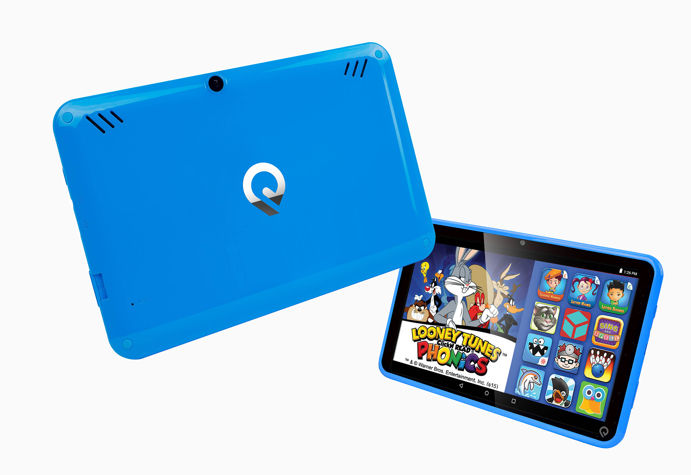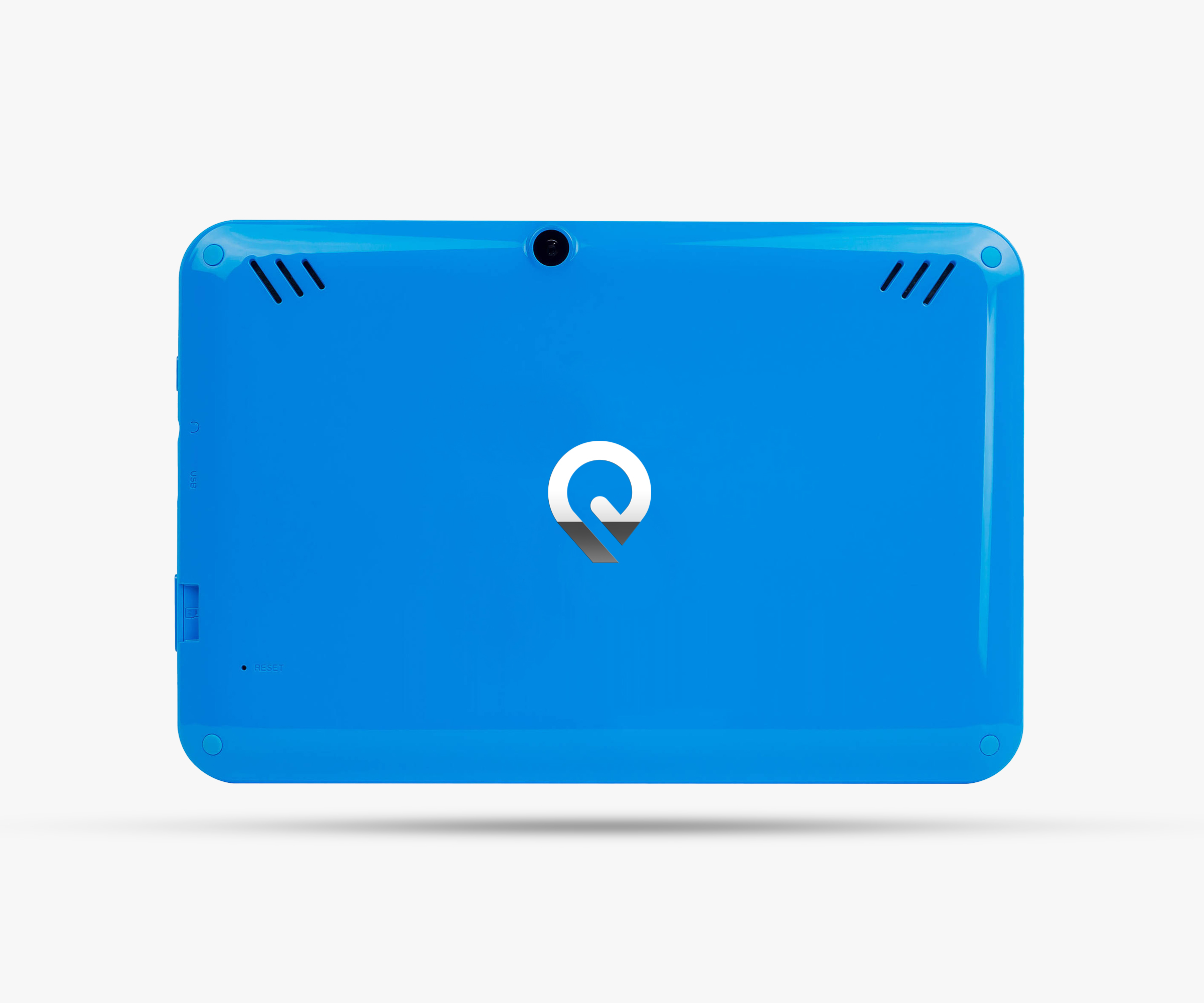
EPIK LEARNING
Ashcraft Design refreshed Epik Learning’s brand identity to bring it in line with their progressive educational tools & solutions. Epik Learning provides unique educational solutions for early learners, parents, and students. By defining brand attributes learned through research, Ashcraft Design established a set of clear, precise values that helped simplify and emphasize Epik’s core message of empowering parents and inspiring kids.
Our bold identity establishes a strong brand presence and connects with users through the use of color, light, and materials. The icon highlights the continual search of light and knowledge. The flexible use of colors depending on the situation makes the identity more approachable. The use of the logo in chrome in certain contexts shows how knowledge gives one the opportunity to reflect on/impact their environment. Light is used in literal context with the light emanating from behind the icon, as shown below in black to emphasize the connection between light and knowledge. Video will play a key role in demonstrating how the icon will be lit up from behind as it highlights the path to knowledge.
The new brand identity is a modern expression of Epik’s values and is reflected throughout their brochures, webpages, print, and logo. It delivers a unique experience to Epik’s key demographic so that they can rise above competitors.